Mistakes are bound to happen, in IT as
anywhere. Is it appropriate to fire someone for a mistake? Should we
penalize someone for failure in an innovative venture? I would argue
against it.
Such an atmosphere could be deadly for innovation within any
organization, but more so in an IT organization. Organizations and IT
leaders that do not tolerate mistakes -- or innovative failures -- are
likely to stagnate. Fear of retribution will reduce productivity and
creativity and may cause the most valuable and innovative employees to
leave.
People who do nothing make no mistakes. People who do nothing have no
failures. The more a person does, the more opportunities there are for
that person to make a mistake. So in an organization we should never
penalize for mistakes. What we should do is teach people to ensure that
they take adequate precautions to recover from a mistake. A good example
is making a backup of the system before making a change. Another
example is discussing a high-risk action or plan with other qualified
people before execution.
Risk management should be part of the standard operating procedure.
If a person fails to follow this procedure, we may have an argument for
consequences. It is important to ensure that people feel comfortable
owning up to errors so that appropriate corrective action can be applied
and people can learn how to avoid the mistake in the future.
Quality control reduces errors and mistakes. All members of a team
should work toward an atmosphere where people help each other avoid
errors and share lessons learned. We should never hide or gloss over bad
events.
Innovative people will have some ideas and projects that will not
succeed. The person who executes on 10 innovative ideas will most likely
fail in a few. If you are going to fail, it is important to fail early and inexpensively. It is
dangerous to continue implementing a bad idea for fear of
organizational retribution.
A couple of years ago I had the pleasure of listening to Dr. Jamshed
Irani, former CEO of Tata Steel, who turned around the company in the
late 80s and early 90s by engaging the entire organization in a culture
of innovation. One of the ideas that emerged during his tenure was
Tata's practice of giving "Dare to Try" awards for innovative ideas that were
operationally unsuccessful.
Failed ideas teach us what does not work and provide the opportunity
to think critically so that the next idea has a better chance of
success.
There is an inherent risk of failure in trying anything new. We
should ensure that people within a team are free to speak their minds
and constructively criticize any new idea -- even if the idea comes from
the team leader. People closest to the leader are more likely to see
the flaws in the idea -- they may even be more qualified to evaluate the
risks of the idea appropriately.
After various perspectives have been provided and everyone has had an
opportunity to punch holes in the idea, chances are very high that the
final decision will be stronger, with more of the risks identified and
appropriately addressed. People should not feel bad about saying
something incorrect. Only people who say nothing are always correct.
People who actively participate in discussions are bound to say
something incorrect once in awhile. It is important to recognize and
acknowledge that this is going to happen.
So let us set our people free to innovate, create, and debate; and
let our organizations enjoy the wonderful rewards of such an atmosphere.
A new year, and here's the first round of virtual break-ins.
The online retailer Zappos took a particularly heavy hit. No fewer than 24 million customers were potentially affected
by the theft of names, addresses, email addresses, and password hashes,
but not credit card data, Zappos says -- not, that is, unless you count
the last four digits of credit card numbers.
The consequences, even if critical credit card data has not been
exposed, are hardly trivial. Zappos was compelled to shut down telephone
customer service numbers, because of the anticipated volume of panic
calls, and communicate with the 24 million potential victims by email only,
explaining that their passwords had been expired and needed to be
reset. If just a small percentage of the market segment affected decides
that Zappos' security is untrustworthy, that's a huge loss of return
business.
The circumstances of the theft remain shady. According to Zappos, a
cyberthief accessed the company's networks via a server in Kentucky. How and when, the retailer isn't saying. This doesn't mean people aren't asking hard questions, like why encryption was not more broadly applied to the information Zappos retained. Names, addresses, and email addresses are a goldmine for phishers.
The situation also underlines the argument I've made here
repeatedly that enterprises that choose to retain their customers'
financial data should regard themselves as banks, and act like banks,
for the purposes of security. But why beat up on Zappos when even
security vendors aren't secure?
To the long list of major cybersecurity players taken to the cleaners by the hacker community, we can now add Symantec,
whose "software and services protect against more risks at more points,
more completely and efficiently, enabling confidence wherever
information is used or stored." Right.
This month, the security giant announced
that an early version of source codes for its Norton Anti-Virus product
had been pilfered from a third party. If the Web is to be believed, the
third party was a poorly secured Indian government server, and the
bandits a crew of Indian hackers rejoicing in the name "The Lords of
Dhamaraja" (or Lords of Death, according to Hinduism).
Symantec emphasized that the codes were old, that its own systems had
not been breached, and that it was all a fuss about nothing.
Unfortunately, as of this week, those statements are no longer operative. Apparently, some rather more valuable codes were stolen, too, including the source code for its pcAnywhere
remote access product. Like Zappos, Symantec will be "reaching out" to
pcAnywhere customers, and there probably aren't 24 million of them.
Again, there are many unanswered questions. Symantec is talking about a 2006 security breach.
Presumably, that's distinct from the breach of the systems in India
that has prompted the bragging by the Lords of Dhamaraja. If so, what
are the details of the 2006 breach? Furthermore, how widely is Symantec
required to distribute its source codes among its customers? How much
valuable code is sitting on vulnerable servers for which Symantec itself
has no responsibility?
Maybe the answers are in Symantec's whitepaper "Why Breaches Happen and What to Do About It."
Microsoft's first shot at a tablet: Surface reviewed.
The company has sold operating systems for other companies' computers
for more than 30 years. Sticking to the software and letting other
people deal with the hardware side is what made Microsoft the
multinational behemoth that dominated the computing landscape through
the 1990s and much of the 2000s. MS-DOS; 16-bit Windows 1, 2, and 3; the
hybrid Windows 95 family; and the 32-bit (and, later, 64-bit) Windows
NT family that is still with us to this day: all were sold primarily to
computer OEMs for preinstallation on new machines.
With Surface, Microsoft is diving headlong into a new business model.
Let's be blunt here: Redmond is going the Cupertino route. Microsoft is
not merely writing the software. It's designing hardware to go with
that software, and contracting manufacturers in East Asia to turn its
designs into millions of units of real, shipping hardware, that
Microsoft will be selling directly to customers.
Specs at a glance: Microsoft Surface with Windows RT
Why the change of heart? The president of Windows and Windows Live
Division, Steven Sinofsky, says that Microsoft has its own point of view
when it comes to tablets. He pointed at Google, Amazon, and Apple,
saying that each of them have their own tablet take. Google's world is
centered on search and collecting data; Amazon's tablets are intended to
drive purchases from Amazon's store; Apple's is designed to capitalize
on the iPhone's familiarity. Microsoft's take is the same as it has always been: the tablet is a sort of PC,
with all the flexibility, extensibility, and variety that that entails.
This mindset is fundamental to understanding why Windows 8 is the way
it is. It's also why Microsoft continues to sell its operating system to
OEMs; it knows that there's too much variety in the market for one
company to meet every need.
But Microsoft has a competing pressure. It wants to show off its
software in the best light possible, and controlling the whole
experience—software, hardware, and even retail—is how it plans to
achieve that.
Quite how Microsoft will sit in the broader tablet market isn't yet
entirely clear. The company is keeping very quiet about production
volumes and expected sales figures. There are a few predictions and
rumors floating around, putting expectations in the region of low
millions. That's a smaller scale than, for example, Amazon's Kindle Fire
or Google's Nexus 7, but still substantial for a first product.
If nothing else, the limited distribution—Surface will initially be
available in just eight markets—will serve to limit Surface's ability to
disrupt the OEMs, making the computer more of a Nexus-like benchmark
than a complete transformation of Microsoft's business model. But we
can expect that to change with time. Studio B, the building in Redmond
that houses the Surface team, is taking hardware seriously,
and Microsoft wants to create a sustainable, profitable hardware
business to position itself as a "devices-and-services" company.
Surface is the first product to reflect this devices-and-services
ambition and I've been test driving one for about a week. Does Microsoft
have what it takes to be a player in the hardware market? Can it take
on not just the OEMs, but the Apple juggernaut?
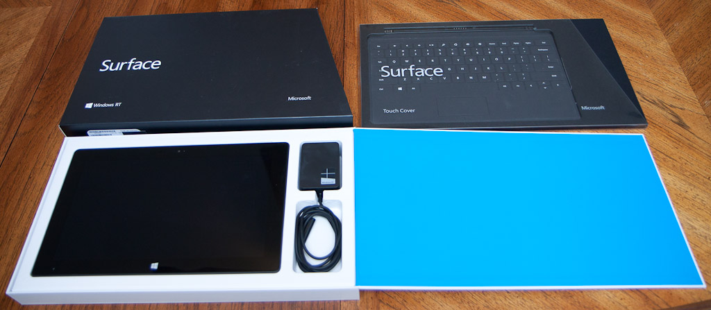
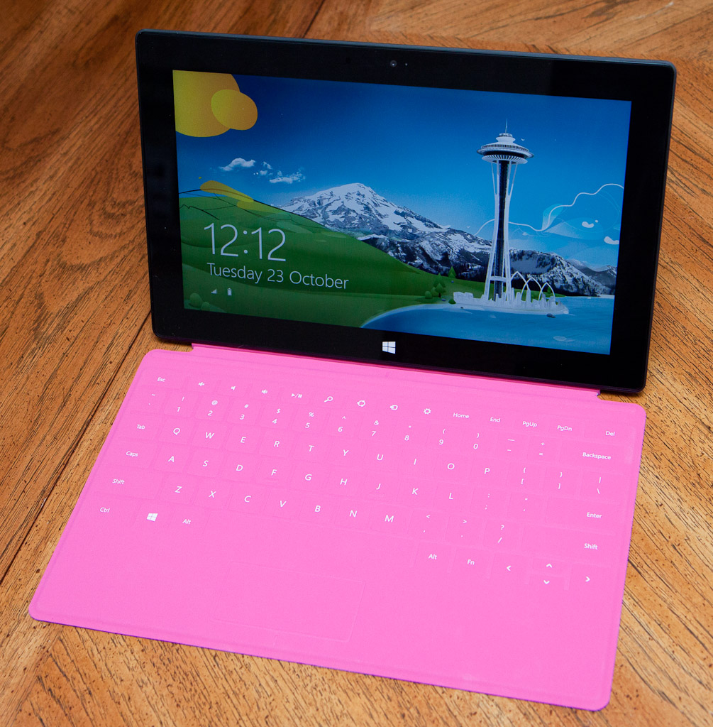
It's a tablet
Enlarge / The packaging is neat and not too excessive.
With the way Sinofsky emphasized Microsoft's desire to put its own
stamp on the tablet market and ensure that its hardware experience was
the best possible, one might have expected something a little more
exotic than a black widescreen slab. A black widescreen slab is what we
have.
I think it's a good looking slab. The shape is squarer and more
angular than many competing products, which I enjoy. It's slim, at 0.37
inches (9.4mm), and light, at 1.5lb (681g). Its front face is dominated
by the 10.6-inch, 16:9, 1366×768, Gorilla Glass 2-covered IPS screen.
Above the screen are a 720p camera and a little light that illuminates
to show that the camera is in use. Below that sits a Windows logo that
serves as a Start button.
All hardware designed for Windows 8 will sport a Start button
positioned centrally below the long edge of the screen (except for
hybrid laptops, which are given more leeway in their positioning) and it
is an irritating design flaw that Microsoft has mandated. Sinofsky has
said that one of Surface's immutable design constraints was that it was
intended for two-handed operation, held in landscape mode. Windows 8 and
RT similarly are built for this mode with their convenient thumb keyboard. Problem is, when held this way the Start button is unreachable.
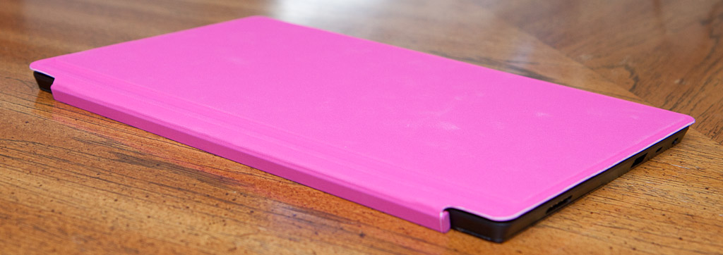
The front of the machine is covered edge-to-edge in Gorilla Glass. All other sides are metal. Surface is made from injection molded magnesium alloy, the same
technique used for building the internal structures of SLR cameras. The
results are stiff and robust (and enjoyably flammable)
but also lightweight. How stiff? Well, Microsoft has turned one Surface
tablet into possibly the world's nerdiest skateboard by attaching four wheels. The black (or "Dark Titanium," as Microsoft calls it) finish is a
result of Microsoft's VaporMg (pronounced "Vapor Mag") vapor deposition
technique. The result is hard to scratch, easy to grip, and comfortable
to hold. It's also a veritable fingerprint magnet. Keeping your Surface
looking smart will require kid gloves.
The edges of the machine all have a 22° angle, which has the effect
of making the rest of the machine "disappear" when you're looking at the
front. It also feels good in the hand. The Surface is comfortable to
hold, feeling well-balanced.
Ports on the right side. From top to bottom: speaker, video, USB, power.
Buttons and ports
Around the edges of the machine are various buttons and connectors.
From top to bottom on the right, we have a speaker, mini-HDMI, full-size
USB 2.0, and the magnetic power connector. I've taken an instant
dislike to the power connector. The magnets are so strong that the
Surface aggressively grabs the connector, snatching it away from my
grasp. It doesn't, however, seat the connector properly within its
receptacle, so the system can't actually charge. I have to jiggle the
thing and reseat it every time.
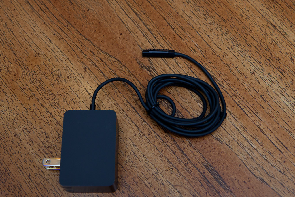
Enlarge / The ill-behaving magnetic power connector.
Enlarge / It's not USB charging, but as a result, it fills the battery in less than two hours.
At the other end of the power lead is a 24W wall wart. There's no
option here for USB charging. Sinofsky described this as one of the many
trade-offs that have to be made when designing hardware. USB charging
is useful, because it means that you can carry around fewer chargers.
However, it's also power constrained; although the USB working group is
producing a high power (100W) standard, current USB 2.0 is limited to
2.5W and USB 3.0 to 9.0W.
With Surface's 31.5Wh battery, that would
produce a best-case charging time of 3.5 hours over USB 3.0 (assuming
the machine has its screen off and is idle, so all the energy slurped in
over the port can be stored in the battery), and more than 12 hours over USB 2.0. With the 24W charger, a full charge can be had in around 80 minutes.
The positioning of the power connector is also aggravating. If you're
holding the Surface in the two-hand landscape style—the style that was a
design constraint—your right hand goes where the power connector
attaches. The connector gets in the way. It's not as bad as on some
other machines I've used, however. Samsung's Series 7 Slate puts its
power connector in the same place, but unlike the flat connector of
Surface, it's a conventional circular jack that juts out perpendicular
to the side of the machine, rather than lying alongside it. Nonetheless,
the Surface's placement seems to be at odds with the intended design
and usage of the machine.
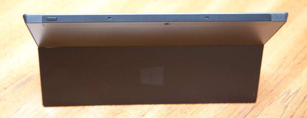
Enlarge / Just the power button and two microphones.
On the top edge there's a power button and two microphone holes. The
top edge and a small portion of the rear are covered in a material that isn't
magnesium alloy. It's probably plastic (though Microsoft would not
confirm this), and positioned behind it are the twin MIMO Wi-Fi
antennas. This presumed-to-be-plastic piece also houses a second 720p
camera, mounted on the rear of the machine.
Ports
on the left. From top to bottom we have a speaker, a 3.5mm headphone
jack, a volume button, and then the chamfer for opening the kickstand.
On the left edge is another speaker, a 3.5mm headphone jack that
you'll want to use instead of the built-in speakers (as they're rather
quiet, even at full volume), a volume control, and a chamfer to make it
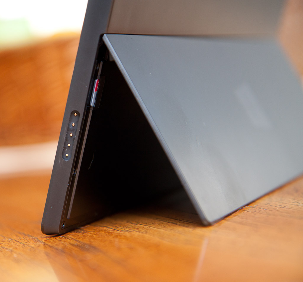
easier to flip out the kickstand. Tucked away behind the kickstand is a
microSDXC slot.
Enlarge / You can just see the edge of the microSDXC card poking out from under the kickstand.
Not present? A rotation lock button. There's a software lock, but I
would have liked a hardware button; much easier to tap a hardware button
before handing the device to someone to show them something than fuss
around with the icon on the brightness slider in the settings charm.
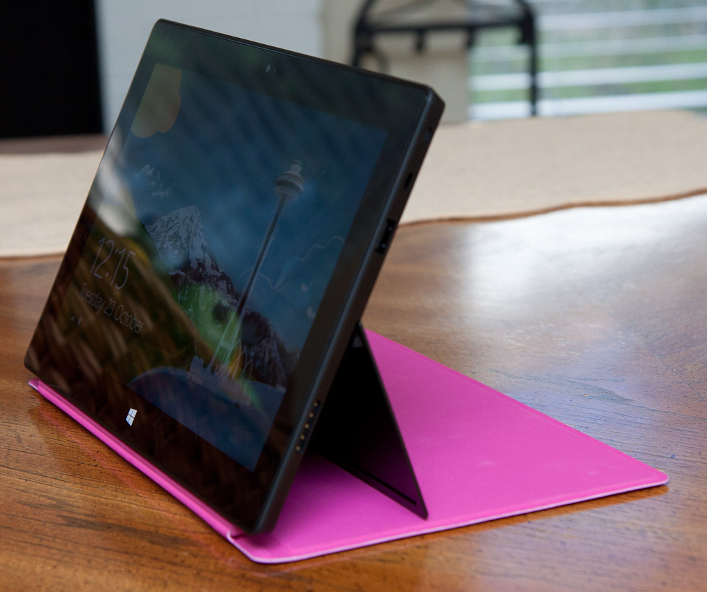
Kickin' it
The kickstand is Microsoft's first key point of differentiation. When
closed, it fits flush with the back of the machine. It opens with a
confident, assured click, snapping securely into place. When deployed,
it props the screen up at a 22-degree angle.
Sinofsky and Panos Panay, General Manager of Surface, told us that
their goal with the kickstand was to instill confidence. Surface users
should be able to flip it out, certain that it will snap into place
(rather than half deploying, ready to collapse, catching users unaware)
and securely hold the device up.
Although invisible to users, the kickstand uses a complex arrangement
of three custom-designed hinges to do its thing. The left and right
hinges are responsible for snapping the kickstand shut and holding it
open, with an arrangement of cams and springs inside. The central hinge
provides damping to ensure that the metal stand doesn't vibrate and
creates a reassuring noise. It also uses magnets to close more securely.
On a level surface, the kickstand holds the device steady, and on a
desk or a table the angle is satisfactory. The mechanical feel is
enormously pleasing; I would not be at all surprised to find Surface
buyers idly snapping the kickstand open and closed just because it feels
so good. At least if they're left-handed; the chamfer to make flipping
the kickstand out is on the left of the machine. As a righty, I reached
out with my dominant hand every time to try to open the kickstand, and
every time was disappointed. I would have preferred the chamfer to exist
on both sides, but there isn't room on the right-hand side due to the
position of the power connector.
As with all kickstands, however, it becomes much less useful when
used without a desk or table. I was using Surface on my lap as the
passenger in a car. While I appreciate that this is not perhaps the most
ergonomic way of using it, it's a scenario that a laptop handles with
aplomb. I can tilt the screen back far enough to make it comfortable to
read, and push it back far enough on my lap that it's comfortable to
type on.
Enlarge / A small amount of light leaks out of the middle kickstand hinge when the screen is lit.
The kickstand, however, was less than satisfactory. My lap is not
perfectly flat, leaving the Surface unsteady and prone to toppling over
backwards. The kickstand also has a thin edge that was uncomfortable on
the bare skin of my legs.
Similarly, I work extensively with a laptop on my lap, using a Lap Desk.
In the armchair in which I normally sit, the Lap Desk is not
horizontal, it tilts slightly towards from me. With my laptop, that's
fine; comfortable and secure. With Surface, it isn't. The screen angle
is wrong, and the machine topples over toward me. Without the Lap Desk,
it topples away from me.
This is not a "Surface" problem so much as a "kickstand" problem;
it's one of the prices you pay by not having a large base with a stiff
hinge, as a laptop does. As a kickstand, the Surface's implementation is
solid, stable, and reliable, and it has the kickstand advantages of
light weight and elegant integration with the body of the tablet. But
it's still just a kickstand, and kickstands have their downsides.
Keyboardin' it
I neglected to mention the bottom edge of the Surface before. The
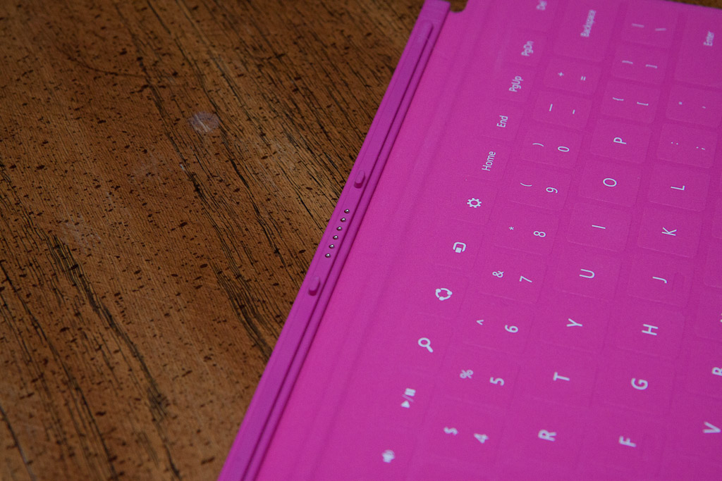
bottom edge contains another connector, the cover port. It's here that
Microsoft's other major point of differentiation comes into play: covers
that double as keyboards.
Enlarge / The Cover Port on the bottom of the Surface.
Enlarge / The keyboard layout is pretty reasonable, though I would have liked a print screen button.
There are two kinds of cover. There's the Touch Cover: a 3.25mm
membrane keyboard weighing in at less than 0.46lb (208g), and the Type
Cover: a 6mm physical keyboard coming in at less than 0.55lb (250g).
Both are six-row (well; five and a half, the function key row is half
height) keyboards with a small two-button touchpad below.
Enlarge
/ The Type Cover layout is the same as Touch Cover's. Unfortunately, I
used it before taking this photo and getting it clean proved difficult.
Whichever keyboard you use, they connect to the cover port and latch
in place magnetically. This latching mechanism is nothing short of
remarkable. The magnets are positioned such that they align and clamp
the keyboard perfectly into place, ensuring correct attachment the first
time, every time. You can't plug it in with the keyboard askew, or
laterally displaced by a few millimeters, or anything else that would
disrupt correct connectivity. If you hear that click, you're good to go.
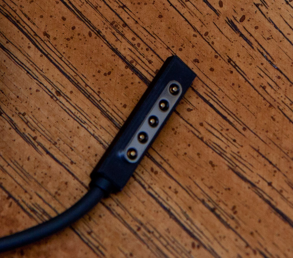
Enlarge / The cover's portion of the Cover Port connector.
Sinofsky and Panay talked about the design spec for the connector's
magnetic attachment. It needs to be strong enough to support the weight
of the Surface unit, but not so strong that a three-year-old can't
disconnect the two. I don't have any three-year-olds to test the ease of
disconnection, but I can say that it does indeed support the weight of
the Surface. Dangling the computer from the keyboard feels very
unnerving, but it works.
Like the kickstand, the magnetic clamping mechanism used to keep the
keyboard covers attached is going to be another boon for fidgeters
everywhere. You'll want to disconnect the keyboard over and over just to
experience the "snap" as the two pair together. It's no wonder that the
Surface ads tell you to click in.
I do have to wonder, though: if Microsoft can make a magnetic
connector this good, why does the power connector have none of these
qualities? That connector has to be carefully placed and doesn't always
make a proper connection.
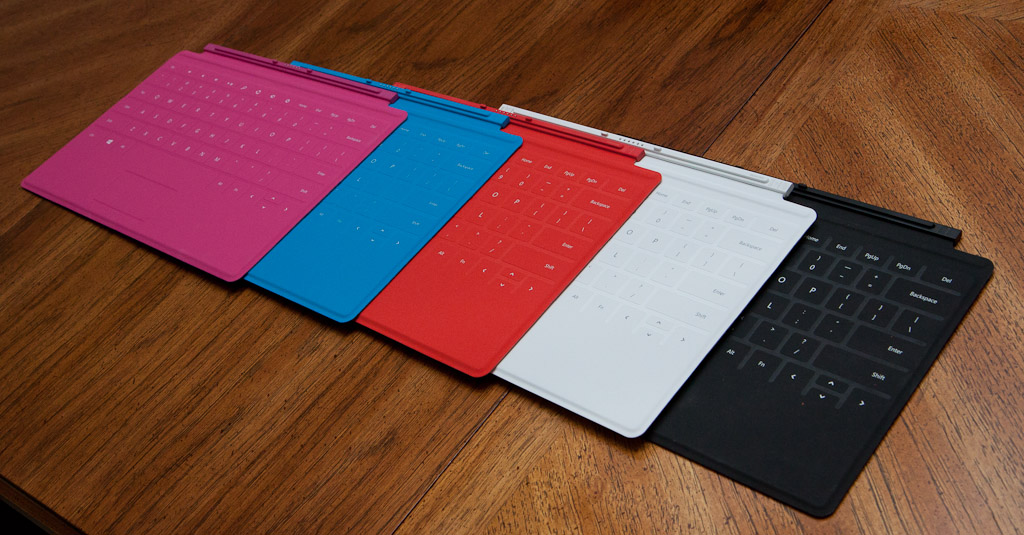
On to the keyboards themselves. The Touch Cover is likely to be the
more widespread option. Some Surface units will ship with a black Touch
Cover, and they're also available in white, cyan, magenta, and red
(though not all colors are available in all markets).
They're covered in
polyurethane that should prove hard-wearing and water resistant (I was
told that they should withstand scouring pads, though I admit I'm too
chicken to try—we had to promise to return our review units unharmed),
with laser-etched print on the keys.
The black ones seem to have a kind
of grey felt covering on their rear; the rest are smooth.
Enlarge / The black keyboards sport this mottled grey finish instead of being plain black.
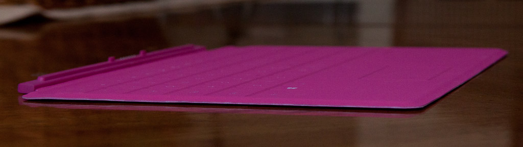
Enlarge / The Touch Cover is a little over 3mm thick, and its key surface is almost completely flat.
They are membrane keyboards, essentially flat, with keys that have
no give or mechanical action to them. Still, their typing surface is
not completely smooth. The top layer is cut away around the keys and the
space bar, creating gaps that are a fraction of a millimeter deep. The
"f" and "j" keys also have little indentations cut into them. The result
is that you can feel where the keys are, and thanks to the cut-outs on
the "f" and "j," touch typists can correctly orient their hands on the
home row without looking. For touch typists, this kind of thing is
invaluable.
The keyboards are also smart. Underneath each key is not simply a
switch that's on or off, but a pressure sensor. The keyboard samples the
pressure applied to each key 1,000 times per second, and performs all
kinds of processing to turn this into usable key output. For example,
pressing a key typically results in a series of (imperceptible) bounces,
where your finger ricochets off the key's surface and then slams back
against it. The pressure sensors detect this, and translate it into a
single key press.
Conversely, touch typists will rest their fingers lightly on the
surface of the keyboard between keystrokes. The firmware in the keyboard
knows about this, and will ignore any light pressure on the keys.
Presumably in an effort to make up for the lack of feedback from the
keyboard itself, each keystroke on the Touch Cover causes the Surface to
make a noise—the same noise as the on-screen keyboard makes.
The Touch Cover also makes concessions for the vagaries of real
typing. People often strike the space bar a bit low, along its bottom
edge. With a physical key, that's normally fine; the keycap still goes
down and the strike still registers. Without a physical key, that would
normally result in a missed space. To counteract that, the pressure
sensor for the space bar extends below the apparent bottom of the
keyboard, allowing it to smartly detect these low strikes on the
spacebar.
The result of this? Look, I expected to hate the Touch Covers. I wanted
to hate the Touch Covers. As a fluent touch-typist who normally uses an
extremely loud Dell clicky keyboard, the Touch Covers represent an
affront to everything I stand for. But the damn things work, and work
well, and I don't really know how I feel about that. They do
take a little getting used to; it will be a few days before you're
really comfortable on them. Fifty words per minute should be readily
achievable, with an accuracy and convenience that surpasses any
on-screen keyboard.
For really extensive typing, the Type Covers are better still. They
don't offer a huge amount of key travel—there's only so much you can
manage with a thickness of 6mm—but they're crisp and consistent. While
the Touch Cover really is surprisingly good, anyone planning really
heavy keyboard usage will be well-served by the Type Cover.
Enlarge / Type Cover's extra bulk is what gives it its better typing feel.
The controllers within the keyboards are taken from one of Microsoft's gaming keyboards, the SideWinder X4.
This has the repercussion of supporting full N-key rollover—hold down
all the keys, and the keyboard will report them all back to the
operating system.
In desktop keyboards, this is a big deal for gamers
(it's also something that Lenovo users might find interesting—that beep
you hear when you hold down, for example, "s," "d," and "c"
simultaneously is due to the lack of N-key rollover that Lenovo
inherited from IBM). For tablets like Surface it's little more than a
novelty, a little piece of technology that Microsoft reused rather than
recreated from scratch.
Both kinds of cover include a small touchpad. Both touchpads support
two-finger scrolling, but don't appear to support any other
gestures—probably a consequence of their small size. Scrolling for both
touchpads is backwards, or what Apple would describe as "natural." Drag
your fingers down, and the thing you're looking at scrolls to the top.
This is the reverse of the typical Windows scrolling behavior. Apple
lets you revert to conventional scrolling; Microsoft appears not to. I
wish it did.
The lack of broad gesture support is disappointing, because the new
Windows 8 touchpad gesture capabilities work well. On supported touchpad
models, you can swipe in from any edge of the touchpad, and it has the
same effect as swiping in from the edge of a touchscreen, revealing
charms, the task switcher, or each application's toolbar.
Obviously this
is not essential on a device with a touchscreen, but if I'm in a
keyboard-and-touchpad kind of a mood, it's nice not to have to reach up
to the screen all the time. Just as the keyboards differ in their tactile support and clickiness,
so too do the touchpads. The Type Cover's touchpad has a mechanical
click to it. Touch Cover's does not.
Unfortunately, I find both touchpads are just too small to be even
remotely pleasant to use. They track well enough when my fingers are in
the tracking area, but the tracking area is just too small. Given the
constraints imposed by the size of the Surface itself it's hard to see
how Microsoft could have made the touchpads substantially larger (though
perhaps there is scope to make them a few millimeters taller).
How big a deal this is depends on where you're coming from. If you're
looking for a tablet with the option of precise control when you need
it, the touchpads are certainly a step up on finger input. If, however,
you're looking at more of a laptop replacement, the small touchpads
could have you thinking unkind thoughts about netbooks.
Enlarge / Closed up, the Touch Cover adds little to the thickness of the Surface.
With touching and typing handled, what about the other role the
covers must serve: covering the screen? Designers who worked on the
Surface project told us that the model they wanted to emulate was that
of a book. You should just be able to slap the cover shut, open it, and
fold it right back behind the machine as easily as you do a book cover.
Enlarge / Type Cover adds a little more bulk, but still leaves a slimline package.
As a result, there are no magnets or other fasteners to keep the
cover in the closed position, nor in the folded back position. While on
the one hand this means that opening the cover is effortless, it also
means that if you're holding Surface like a book, hinge side down, that
the cover will flap open of its own accord unless you clench it tightly
shut.
This wouldn't be an issue if it weren't for the level of integration
between the cover and the Surface. The covers contain within them
sensors so they know what position they're in; closed against the
screen, deployed ready for typing, or folded right back against the back
of the machine.
They use this information to do sensible things such as
disable the keyboard when folded right back, lock the screen
orientation when deployed for typing, and turn the screen off when
closed.
Enlarge
/ Microsoft envisages Touch Cover being used this way for things like
watching videos. You wouldn't want to do this to a book cover anyway.
This has the consequence that the cover flapping away means the
screen stays on, pointlessly burning battery life. While I do "get" the
book idea, it strikes me as a bit of a rationalization. Sticking an
extra magnet or two in to make it stay closed would have made the covers
that much better.
Microsoft also said that the magnetic cover connector will, in
principle at least, be licensable by third parties. This opens the door
to a broader selection of peripherals connecting to the same port.
The screen
The kickstand and the keyboard covers are the Surface features
designed to set it apart from the competition. With those out the way
it's time to talk about the most important part of any tablet device:
its screen.
Microsoft describes the Surface screen as using "ClearType HD"
technology. It's a 16:9 display with a 10.6 inch diagonal. It has a
resolution of 1366×768, or a little less than 150 pixels per inch. It
uses IPS technology (or an IPS variant) to ensure wide viewing angles
and good color accuracy. It supports five point capacitive touch.
The unusual 10.6-inch diagonal was described by Microsoft as being a
trade-off between size and battery life. 10.1 inches is the standard
size in the "about ten inches" category, but Sinofsky said that this
made Windows' snapped view, where two Metro applications run
side-by-side, too small. 11.1-inch screens solved that problem but used
more power.
To attain the same run time would have required a bigger
battery, which in turn would make the system heavier. The 10.6-inch
screen is supposed to make snap view big enough while also permitting
"all-day" battery life.
What makes it "ClearType HD"? Apart from Windows' use of the latest
iteration of Microsoft's sub-pixel anti-aliased text rendering,
ClearType, the main feature of the screen is that the touch sensor is
optically bonded to the LCD.
Traditionally, capacitive touch LCDs have three layers of glass. The
bottom layer is the LCD itself. Above that is a thin air gap, then a
second piece of glass coated with a grid of indium tin oxide. This is
the capacitive sensor. A third piece of cover glass to protect the
sensor glass is then glued on top with an optically clear adhesive—this
is where Corning's Gorilla Glass is used. At every glass-air boundary (or indeed, every boundary between
materials with different refractive indices), some light ends up being
reflected rather than passing through the boundary. This conventional
screen design has three such boundaries; air to cover glass, sensor
glass to air, and air to LCD. The result is some loss of light from the
screen (14 percent, in the Kindle Fire HD, for example) and multiple
reflections from ambient light sources. The layer of air and adhesive
also adds to the thickness of the panel (1.55mm in the Kindle Fire HD). ClearType HD screens improve the situation by using a touch sensor
made from a film of indium tin oxide immediately below the cover glass,
rather than a glass sensor. It also replaces the air gap with a layer of
optically clear adhesive. This has several effects. It makes the screen
more transparent, thinner (1mm), and lighter. It also makes the screen
stiffer—contributing to Surface's skateboard strength. As an added bonus, the change in the refractive properties of the
screen mean that the image is perceived as being behind just 0.7mm of
glass, rather than behind the full 1mm thickness of the screen, making
touch seem a little more direct. This approach to building screens is used in a few
smartphones—including the iPhone 5—and OLED screens are also built
similarly. However, it's rarer on larger screens, because the larger the
screen the harder it is to bond the layers together without something
getting screwed up. That said, this kind of process isn't unique to Surface. The Asus VivoTab RT
has a similarly bonded screen with cover glass, sensor glass, and LCD
all stuck together (Asus calls its technology "TruVivid"). Although
Asus' screen is a little smaller, with a 10.1-inch diagonal, the overall
result is essentially the same. Never mind the technology, though. The spec that everyone will look
at is the resolution, and 1366×768 compares very unfavorably with the
iPad. Microsoft says it's another trade-off. Higher resolutions are
harder to drive, both in terms of power usage and the demands placed on
the GPU and software. The 4:3 aspect ratio of the iPad also means that a
lot of its screen space is wasted to letterboxing when watching video,
which Microsoft not unreasonably argues is a common usage scenario for
tablets. The company spent a lot of time arguing to the assembled journalists
who visited Redmond a week ago that the resolution wasn't a big deal.
The argument goes like this: perceived image quality is not simply a
question of the screen's resolution. It depends on numerous factors,
such as the viewing distance, screen contrast, choice of text rendering
and image resizing algorithms, ambient lighting, and more. For example, the ability of the human visual system to resolve fine
detail relies on there being sufficient contrast between image features.
If the contrast is insufficient, the detail just turns to blur. This can be dependent; contrast
depends on the luminance of both dark and light parts of the image. If
lots of ambient light is being reflected, this will increase the
luminance of dark parts of the image and hence reduce the contrast. To prove its point, Microsoft set up a blind test. A Surface and a
"Retina display" third-generation iPad were placed side-by-side with
their bezels and logos hidden, so that we could not see which was which.
In a scenario with relatively bright and even ambient light, at viewing
distances typical of regular laptop usage, the Surface more than held
its own against the iPad, with Microsoft's device producing both text
and images that were clearer and easier to read than Apple's thanks to
reduced glare and better perceived contrast. There's nothing wrong with Microsoft's science as such. It's just
that it doesn't tell the whole story. Tablets are designed to be picked
up and held. Do that and you tend to bring the device closer to your
eyes, pushing the advantage in Apple's favor. Reduce the level of
ambient lighting and again the advantage tilts back in Apple's favor. So while there are certainly situations where Microsoft's screen
looks better than Apple's—and these situations might even be commonplace
if we were comparing laptops—as a tablet screen it would be
better served with a higher resolution. If that means that battery life
is worse, the solution is to enlarge the battery. After all, Apple
manages to cram a 42.5Wh battery into the iPad, and the iPad is ever so
slightly lighter than the Surface. When considered on its own terms, the screen subjectively looks good.
It's not bright enough for true readability in bright sunlight (its
brightness is a decent 400 nits), but is fine in shade and indoors.
Viewing angles are great, blacks are black, and colors are colorful.
Sensors
Enlarge / In typical indoor light, the picture quality was everything we have come to expect from cheap webcams.
The best thing that can be said about the front and rear cameras is
that they work. The picture quality isn't the worst I've ever seen, but
it's far from the best. Pictures taken indoors show the noise and
artifacts that we've come to expect from digital cameras in poor light.
Pictures taken outdoors are a little better.
Enlarge / The rear camera indoors shows comparable quality to the front-facing one.
Enlarge
/ The rear camera outdoors. The lighting was unforgiving; such is the
nature of sunny days. You can see that it's a tree, but this isn't
exactly worth keeping.
The Surface also contains the usual accelerometers and gyroscopes, so
it knows what orientation it is being held in and can respond
accordingly. These all seem to work as well as can be expected. The custom-designed 2x2 MIMO antennas provided consistently excellent
network reception. The Surface can see more access points than any of
the phones or laptops I have access to, so you can be confident that if
there is a Wi-Fi access point anywhere nearby, Surface will find it. Bluetooth mice and keyboards appeared to work as expected, though as I
lack any high-speed Bluetooth 3 devices or low-power Bluetooth 4
devices, my experience is limited. What I found disappointing is that Surface has no other connectivity
options. It has no GPS sensor, and there's no option to get integrated
3G or 4G. In a device that's so conveniently portable, the lack of "go
anywhere" capability is disappointing. Sinofsky has said that something
like 80 percent of iPads never leave the home (and hence never need
anything more than Wi-Fi). I have no particular reason to doubt that (I'm sure many iPads are
just used from the comfort of the sofa or bed), but that still leaves 20
percent of devices that do leave the home. Free Wi-Fi is not
as ubiquitous or high-performing as many of us would like. Smartphone
tethering is an option, at least for those of us whose service providers
don't charge through the nose to have it enabled, but I would rather
burn Surface's large 31Wh battery to power my Internet usage than the
small 6.48Wh power source in my smartphone. Surface also lacks NFC connectivity. NFC is still searching for a
killer application, so its absence is not critical, but simple uses like
NFC device pairing and file sharing seem like an unfortunate omission. More than anything else, the lack of NFC, GPS, and 3G/4G strikes me
as peculiar because of Microsoft's claimed goal of using Surface to
provide the best Windows experience. Perhaps we can ignore NFC, but the
lack of GPS and WWAN connectivity means that apps such as Bing Maps are
simply less useful than they might otherwise be. I can't take advantage
of the full richness of functionality that the operating system and its
bundled apps have to offer. Surface ends up falling a bit short of being
the showcase system it is supposed to be.
Performance, battery life, and internals
Our ability to formally test the performance of Windows RT devices is
severely restricted by the lack of available benchmarking applications
for the platform, leaving us with little option but to use in-browser
tests. The Surface ran SunSpider in 969 milliseconds, and got a score of 708
in Google's Octane tests. The SunSpider score is almost identical to
the score achieved by the essentially identical Asus VivoTab RT. The
Surface's Octane score is surprisingly about 15 percent higher than the
VivoTab RT's score. In use, the Surface generally felt quick. One activity was
consistently slow, however; if I started playing a video in the video
app, then switched to another application (pausing the video
automatically) and then went back to the video application (resuming
playback), the app would consistently stutter and drop frames for
several seconds. Some apps started a little slower than I would like,
but this is a trait not restricted to Surface. Microsoft estimates that the battery life in mixed use is "up to
eight hours." That's consistent with my own findings; sometimes a little
more, sometimes a little less, with a workload of browsing and typing.
In a more punishing test, playing video endlessly with the brightness
and volume turned up all the way, it achieved exactly six-and-a-half
hours. The default power management settings are very aggressive, putting
the machine to sleep after just two minutes of inactivity. I was
disappointed that the system doesn't provide an estimate of expected
battery life. Although it tracks the percentage remaining, it doesn't
tell you how long it should actually last given current usage patterns. My understanding is that Windows needs certain information from the
battery and power management subsystem to do this, and while most x86
laptops provide the information, it seems that the Surface does not. The
Asus VivoTab RT is similarly deficient, so it's possible that it's
going to be a Windows RT-wide gap. Having a percentage is all well and
good, but I want a time estimate; I want to know "are you going to last
to the end of this flight, or should I turn down the screen brightness a
bit?" Internally, the Surface is very similar to the Asus VivoTab RT, and I
suspect it will also prove similar to the other Windows RT devices that
come to market. From a traditional PC perspective, it's a little
peculiar. Common PC interfaces like the ATA disk interface and PCI bus
are eschewed in favor of MultiMediaCard and I2C.
Software
The Surface tablet I was given came with Windows RT and Office RT
(out of the box this will be a preview, but updates to the final version
are already available) and nothing else. Windows RT covers all the basics. It includes all the standard Metro
apps that are bundled with Windows 8, including the communications apps
(Mail, Calendar, People [contact management]), Internet Explorer 10, the
media apps (Photos, Music, and Video), and the Bing apps (Bing search,
Weather, News, and several more). It includes almost all of the Windows 8
desktop applets too, such as Explorer, Notepad, and Paint. There are
two notable omissions: Windows Media Player and Windows Media Center are
both absent from Windows RT. Office RT includes OneNote, Word, Excel,
and PowerPoint. Unlike the Asus VivoTab RT,
which has a number of Asus-specific applications (such as a custom
camera app and an app to send SMS messages) promoted in a special
section of the Store, there is no selection of unique Surface-specific
applications, just some recommendations of software that anyone could
use. The only thing that seems to be Surface-specific is the logo that appears when the operating system boots.
Conclusion
The Surface is a nice tablet. The design and aesthetic are pleasing,
the feel in the hands, particularly of the kickstand and magnetic cover
connection is excellent. But is it worth buying on the day of release? The big problem Microsoft has is that right now it doesn't matter how
good Surface is. The decision of whether or not to buy depends not on
Surface itself, but on Windows RT. The only third-party applications
that will run on Windows RT are those that use the Metro interface and
are distributed through the Windows Store. At the moment, there just
aren't that many applications, and many of the ones that exist are
mediocre. If you are confident that the ecosystem will flourish—and fast—and
don't mind the inability to use legacy desktop applications, then
Windows RT is worth considering. If you are a home user who really needs Word, Excel, PowerPoint, or
OneNote, and don't intend to use any of those programs in any capacity
that could be regarded as "commercial," then Windows RT is worth
considering. But if you're not confident that the Windows Store ecosystem will
flourish, or if you think it will be several years before it does, then
Windows RT is not for you. You should be looking at the iPad and iPad
mini, with their large selection of tablet software, or Windows 8, with
its compatibility with a huge body of desktop software. If you want to use Office in a commercial setting, and hence have to
buy a separate Office license anyway, then Windows 8 is almost certainly
the better option. If, however, Windows RT is the operating system for you, Surface certainly has a place. For $499, you get a standalone Surface—no Touch Cover. I was
surprised when Microsoft announced this. The company's previous
marketing material had said the Touch Cover was included, and the advertising puts the Touch Cover front and center—it's almost more prominent than the Surface itself. If you don't buy any cover at all, you're missing out on a large part
of the Surface experience. I would argue that you're also missing out
on a large part of the Windows RT experience: Office RT really needs a keyboard and pointing device to be useful. You'll be almost entirely dependent on Metro-style applications built using WinRT. But if that's something you're happy with—if you're certain that the
Windows Store will be good enough, and you're not especially interested
in Office—Surface looks like it will be the cheapest way to take
advantage of that ecosystem. At $499, it seems that Surface will
undercut the other Windows RT and Windows 8 tablets that have been
announced. For $599 with a bundled Touch Cover, things become a bit trickier. On
the one hand, yes, you get the full Surface experience, and Office
becomes useful. This is Surface the way it's meant to be used. On the
other hand, the Asus VivoTab RT also costs $599 with its clamshell
cover. The VivoTab RT isn't as attractive as Surface, and when paired
with its clamshell cover, it's a bit bigger and heavier than Surface,
but the payoff is that it's more flexible than Surface, it will have
better battery life than Surface, it will have better cameras than
Surface, and it will have better connectivity than Surface. Final pricing on Atom-powered Windows 8 tablets could squeeze Surface
even harder. Though they won't include Office, that shouldn't faze
corporate buyers, as they'd need to buy an Office license even for
Surface. Against that deficit, they'll offer substantially greater
software compatibility, making them much less of a gamble. The $699 unit, which bumps the internal storage up to 64GB and also
includes a Touch Cover, seems hard to justify to me. The extra $100 gets
you an extra 32GB of usable space, but with a 64GB microSDXC card
costing just $60
that makes the extra storage feel very expensive. I would avoid it
unless I had absolute certainty that I'd need every last byte of disk
space. This puts Microsoft's tablet in an awkward spot. The Surface that has
a clear place in the market, the $499 unit, isn't the best model. The
Surface that's the best model, the $599 unit, doesn't have a clear place
in the market. This evaluation will also change over time. It is very early in the
life of the Windows Store—Windows 8 and Windows RT are not even
generally available yet. It's inevitable that the Store will expand,
even if there is some uncertainty about how fast it will do so. And as
the store grows, so too will the value of Windows RT systems, and so too
will the value of Surface.
The Good
Top-notch build quality
Touch Cover really does work
Type Cover is a good solution for high-volume text entry
Clear, bright screen with good viewing angles
First-rate Wi-Fi reliability
The Bad
Touch Cover and Type Cover alike have poor touchpads
No NFC, no GPS, no 3G or 4G
There's no escaping that 1366×768 is a low resolution
$499 unit lacks the all-important Touch Cover
For $599, the Asus VivoTab RT gives you a package that's more versatile and better connected
The iPad Mini launch comes as no great shock, but as the reviews roll in, what remains surprising is how Apple has reacted to the 7-inch tablet hype. The charge towards smaller tablet form factors, led by the Nexus 7 and Kindle Fire HD, has finally been endorsed by Apple.
After watching Tim Cook address an intimate gathering of tech folk from around the world here in San Jose, we've just spent a bit of time playing with the iPad Mini. Here are our initial thoughts pending a full iPad Mini review as soon as possible.
iPad Mini: Build
Lighter and thinner than we'd thought when watching the Keynote, the iPad Mini fits comfortably in one hand, with the reduced-size side bezels giving seemingly more screen real-estate than the Nexus 7. Jony Ive said that Apple had built the iPad Mini from the ground up, rather than just shrinking the bigger iPad. It shows. The rounded edges are reminiscent of the widely loved iPhone 3G and it feels durable enough to sling in a bag.
It's 7.2mm thin (23% thinner than the big iPad) and 308g (Wi-Fi-only model) light. The volume and screen-rotation lock buttons have moved to the right-hand side and the headphone socket is placed on the top, rather than the bottom, where stereo speakers and the new Lightning connector can be found. Reading a book works well – especially with the updated iBooks continuous streaming feature - because of the reduced weight and size. It's a definite competitor to the Kindle in this regard.
iPad Mini: Screen
The LED-backlit screen looks fantastic on the 7.9-inch display. Colours are vivid, text is pin sharp, web pages render quickly and, because there's almost a 4:3 ratio going on, you get a lot of content on page. It feels squarer than the bigger iPad, but definitely works as, arguably, a better mobile experience than its bigger brother.
Screen resolution is 1024x768 resolution at 163ppi – same as the iPad 2 – so apps all work without any letter-boxing. Great news for T3: iPad Edition readers – you'll be able to download and view the interactive issues immediately. Videos and photos look great and you can fit 25 app icons on every page (including the shortcut bar)
iPad Mini: Camera
The back-facing 5MP iSight camera is similar to what we've seen on bigger iPads. Taking pictures or video is easier with one hand, purely because of the Mini's size. In the wild, it's much more manageable than the iPad. Still shots that we took were ok, but 1080p video is more impressive. With stabilisation kicking in, plus integration with iOS6, getting video content online will be easy.
iPad Mini: Performance
Hard to tell in the 15 mins that we had with the iPad Mini, but the A5 processor powered apps, games and websites along very smoothly. It's loaded with LTE, which means you'll be able to use it on EE's 4G network in the UK. 5GHz WiFi means super fast browsing with compatible routers, too. Our experience was impressive and we can't wait to give it a proper run in the coming weeks.
iPad Mini: Battery
Apple claims 10-hours and we hope it's close. The third-gen iPad suffered because of the sheer amount of processing power happening and, for the iPad Mini to succeed as a mobile device, battery life will need to be close to what Apple is claiming
iPad Mini: Verdict
We'd go as far as saying it's our favourite iPad yet. The smaller size, thinner shape and lighter weight makes for a much better mobile experience. It's easy to hold and manipulate in the hand but feels durable and well-built enough to accompany you throughout the day. It's definitely more premium that we were expecting.
The main sticking point, however, is price and at £269 for the entry level Wi-Fi model, it's £100 more than the Google Nexus 7. The iPad Mini will undoubtedly sell like hot cakes and will be at the top of many people's Christmas wish list, but the price still gives Android tabs a place in the market.
iPad Mini release date:
Pre-order starts: October 26. Buy from 8am on November 2 (WiFi-only) Wi-Fi + Cellular models available late November


